
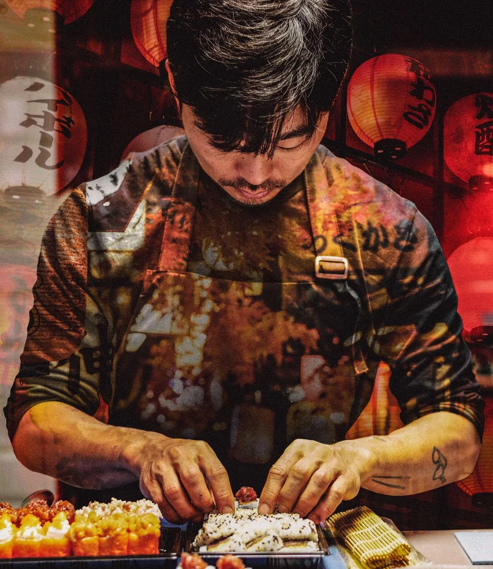
Koosan
A brand identity for a Chinese-Japanese restaurant with a family story behind it.
The brief
Koosan starts in 1920s Japan, with a Chinese student named Shoubai who fell for the food he found there. He began cooking it with Chinese flavours, and the habit became a family one. His grandson, Kan Koo, now runs Koosan in the UK on the same principle.
The identity had to carry that inheritance without turning into a history lesson. Fusion restaurants tend to signal both cultures at once and end up reading as neither, so the work was anchored to a single line: two cultures, one story.
The design
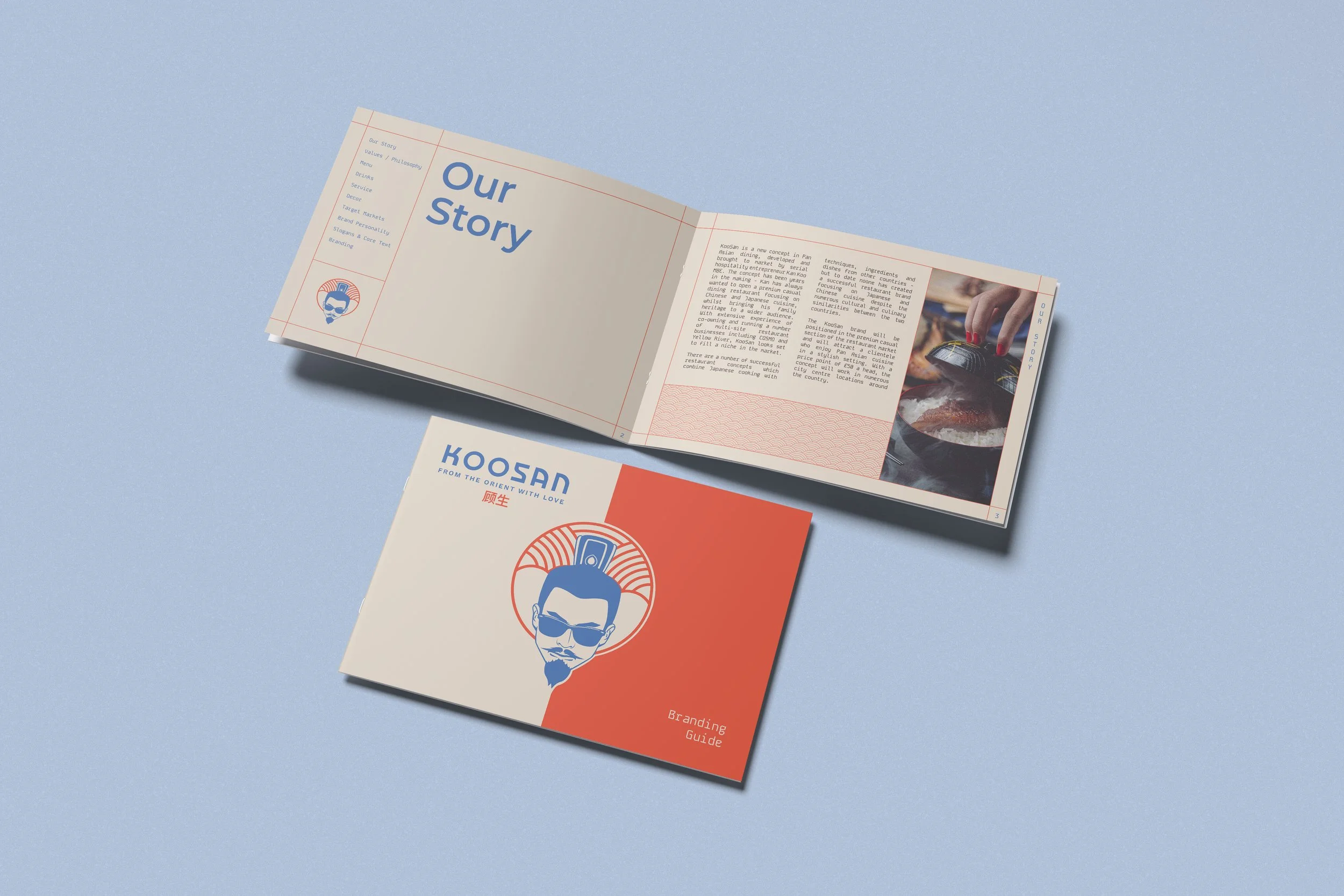
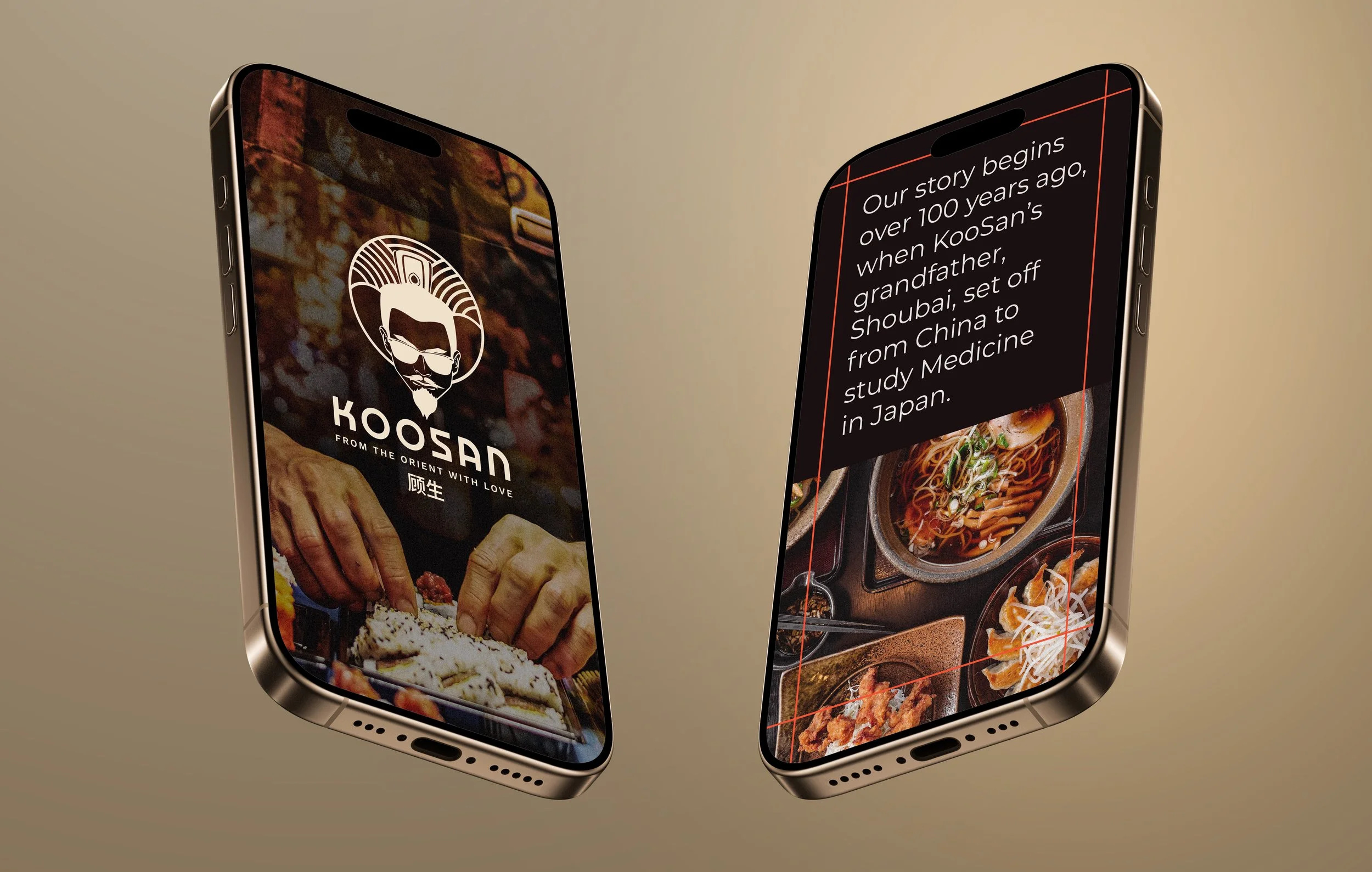
The logo is an illustrated portrait of Shoubai, set inside clean geometry borrowed from Japanese minimalism — the man the restaurant came from, drawn in the visual language of the country he learnt to cook in.
He wears sunglasses. It is the one deliberate break in the system: a century-old story that still has to work on a high street in 2026, and the detail that stops the brand feeling like an heirloom.
The palette splits the same way. Warm reds carry the heritage and the energy; cool blues bring the precision and the calm. Neither culture is illustrated literally - they sit in the colour system instead.
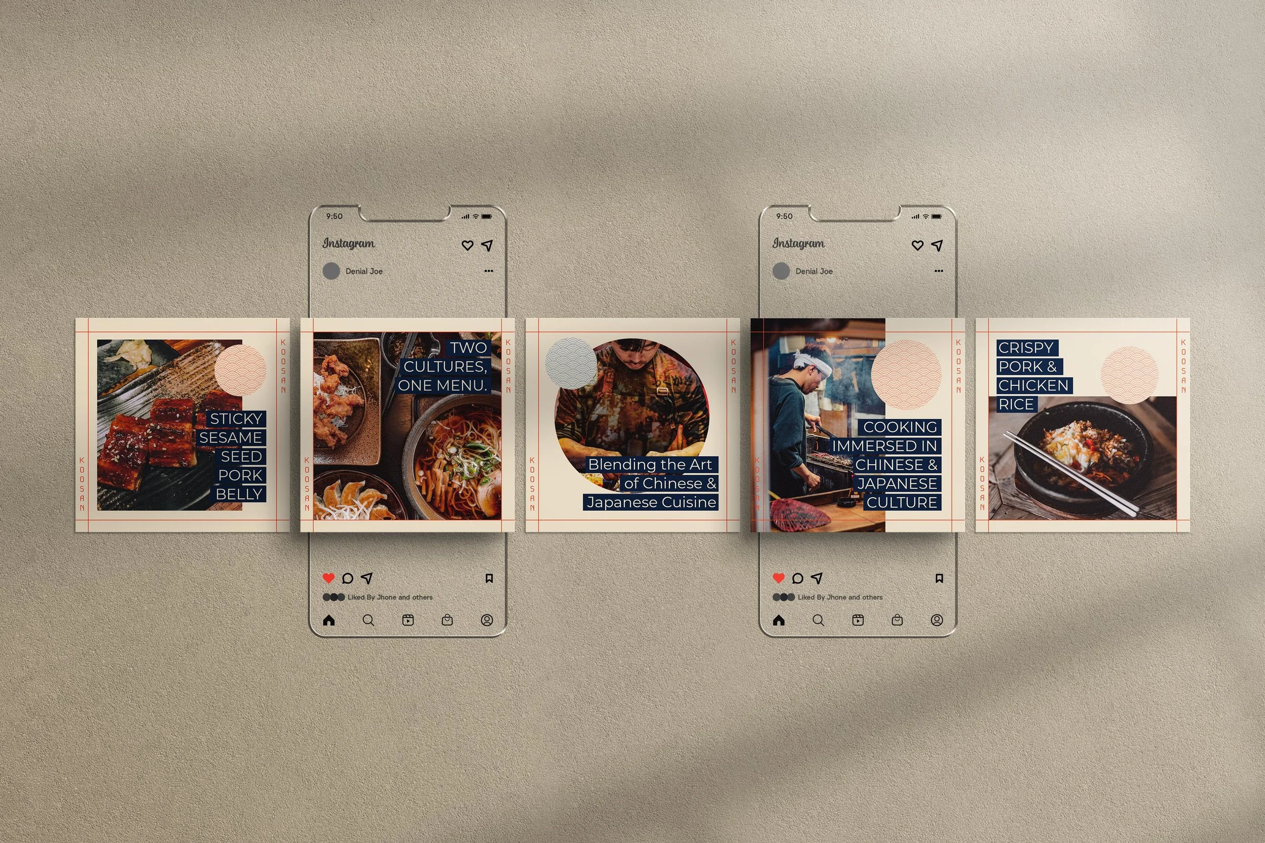
The identity runs across print, digital, social and promotional material from one set of rules.
Results
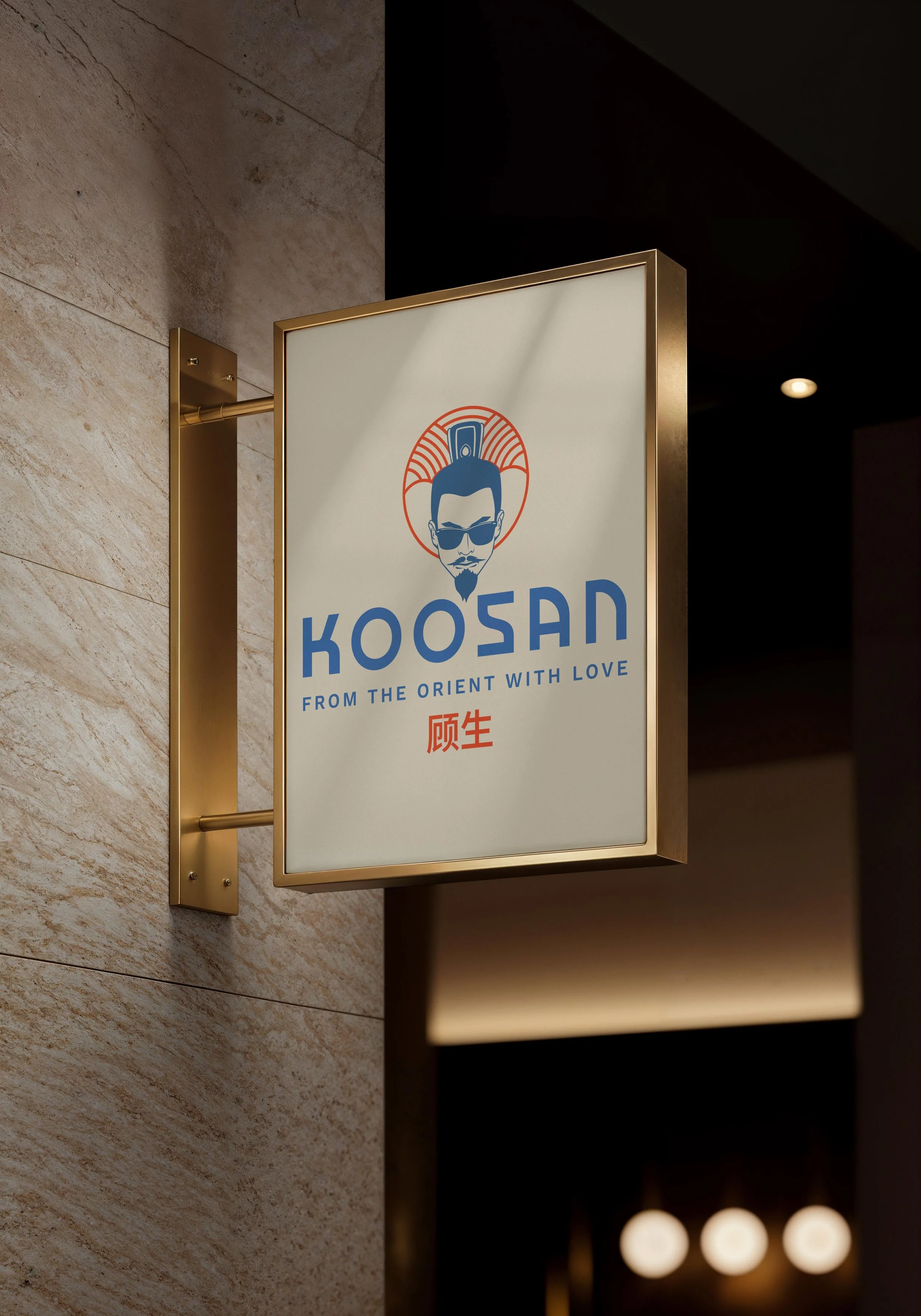
A single system flexible enough to cover menus, signage and social, built around a portrait mark that is genuinely difficult to confuse with another restaurant.