

Eyeconic Vision
A brand identity for a technology-led independent eye care clinic.
The brief
Eyeconic Vision is an eye care clinic built around new diagnostic technology and one-to-one patient care. The identity had to carry both. Optical branding tends to pick a side - clinical and cold, or soft and forgettable - and the clinic needed a brand that read as precise without feeling like a hospital waiting room.
The design
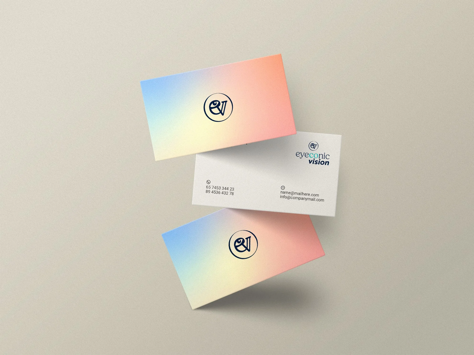
The logo is a streamlined monogram built from the letters E and V, drawn around focus and alignment: the two things healthy vision depends on.
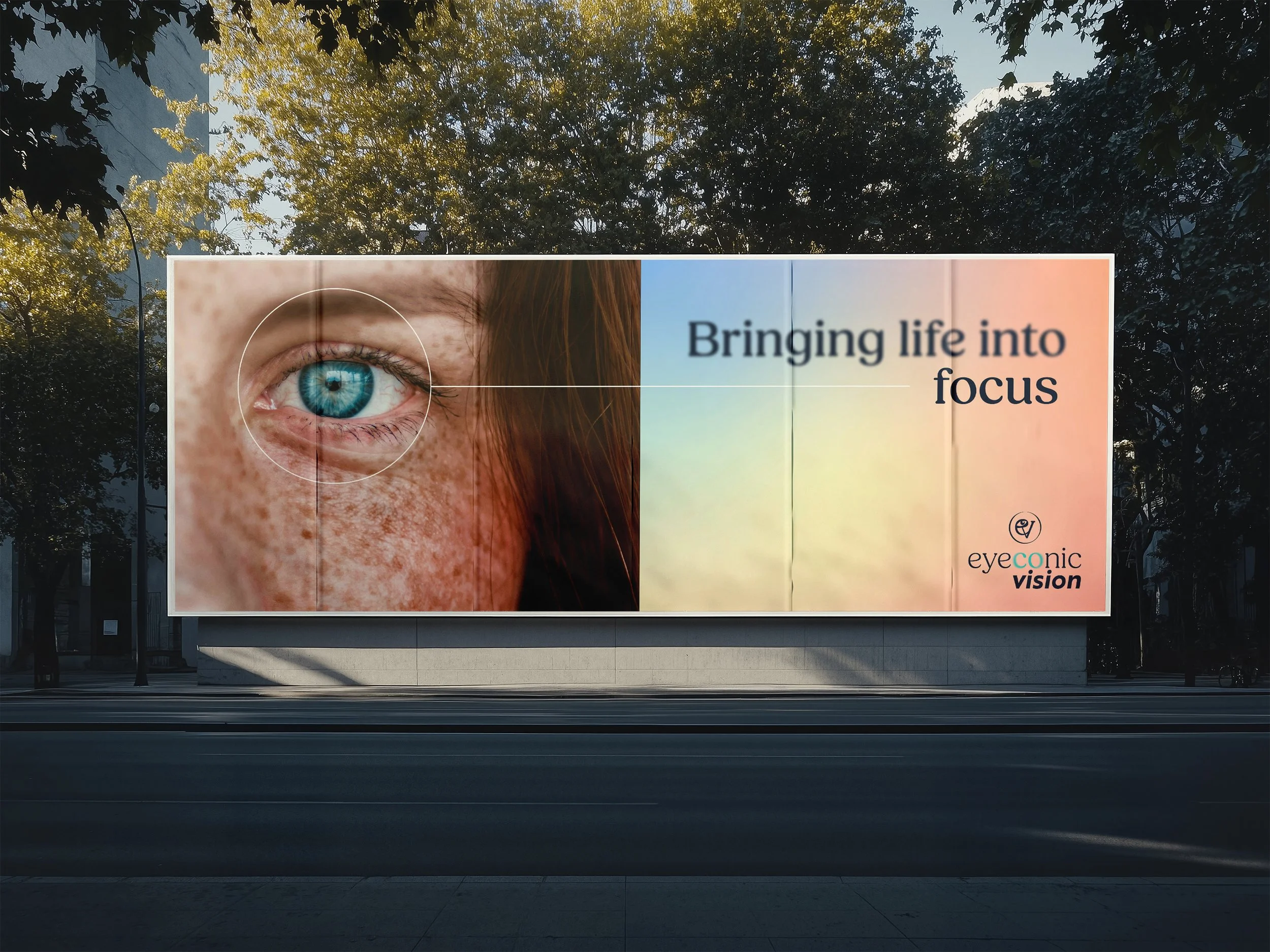
The palette pairs cool blues with warm gradients. The blues do the clinical work; the gradients stop the brand from going cold, and they became the thread running through everything else.
Stationery is minimal by design, so the clarity of the mark does the talking. The gradients reappear as a soft accent rather than a feature, keeping the printed set professional without it turning sterile.
The website mock-up is clean and responsive, built around ease of access — the things a patient actually arrives for sit at the top. The headline, "Bringing life into focus," carries the positioning in four words and gives the site its direction.


Results
A single identity system that holds together across print and web, with a mark that works at all levels and a palette flexible enough to cover clinical and patient-facing material.