
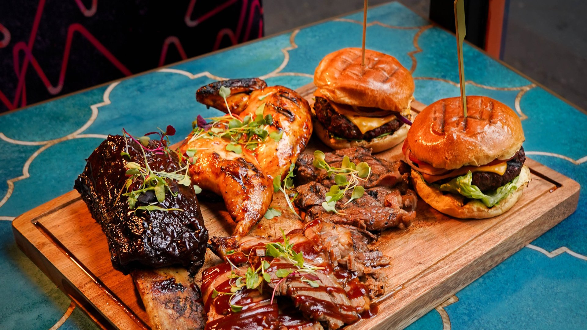
Smoky Boys
A brand built to grow
The beginning
Smoky Boys opened in 2015 on a side street in Watford - a small dining room with a takeaway window for grab-and-go and late-night pick-ups. The owners built the concept on one idea: quality meat, big flavour, fully halal. They were among the first in the UK to serve halal dry-aged Angus beef.
Twelve years and twelve sites later, the brand has been rebuilt four times. Each rebuild had a specific job to do - hold a growing menu together, cut through a crowded delivery market, carry the business upmarket - without losing the customers who found them at that takeaway window.
2017
A typographic system
By 2017 Smoky Boys had three restaurants and a delivery kitchen, and the audience was widening. The menu was growing faster than the identity could hold.
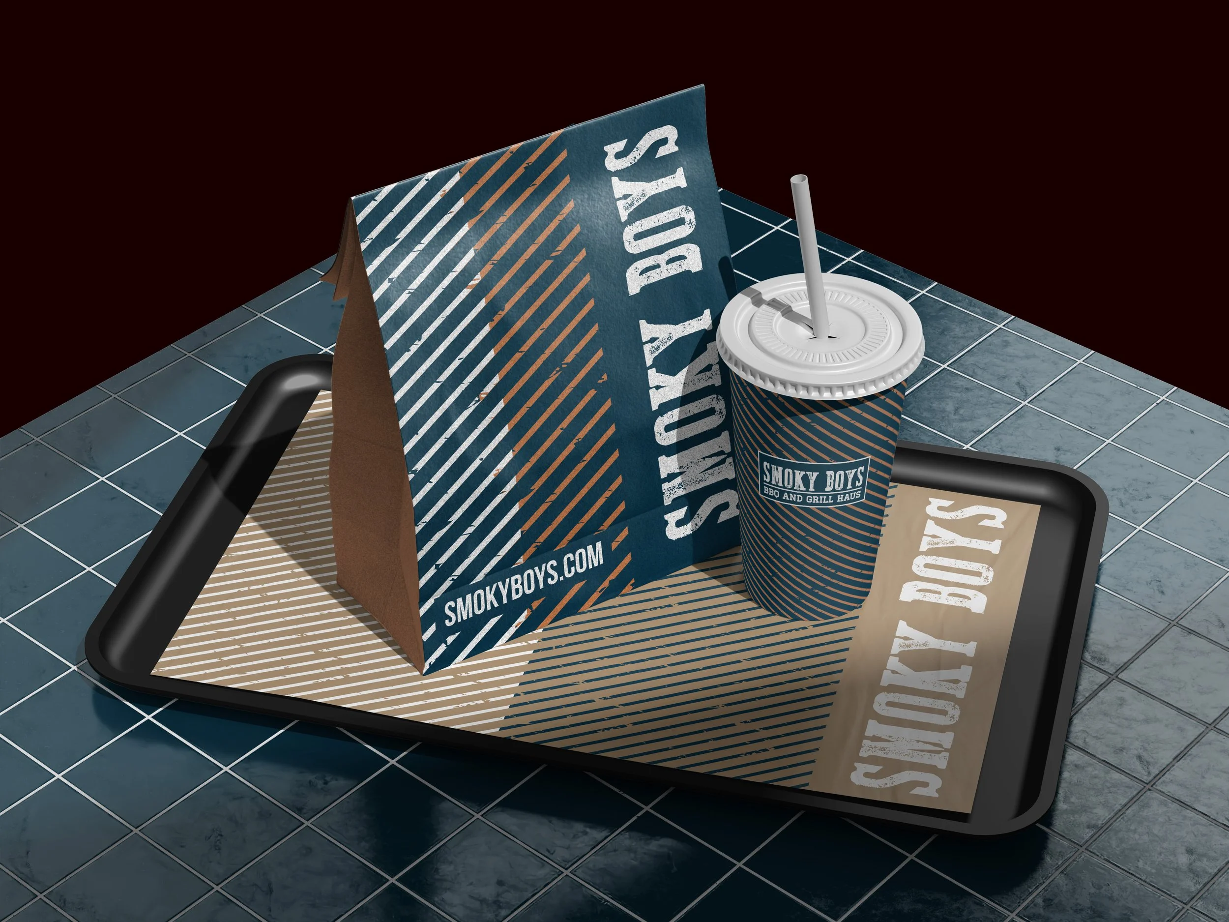
We built a brand system out of type. Rough, hand-drawn display faces gave the brand its character; giving each menu section its own face gave us a way to organise it. The font became the section's signature - reuse it on a poster, a window graphic or a social post and the customer knows instantly which part of the menu it points back to.
2021
Letting the food talk
Lockdown turned Smoky Boys into a delivery business almost overnight, and it thrived there, but with such an increase demand for takeaway and delivery restaurants the identity was getting lost in the noise.
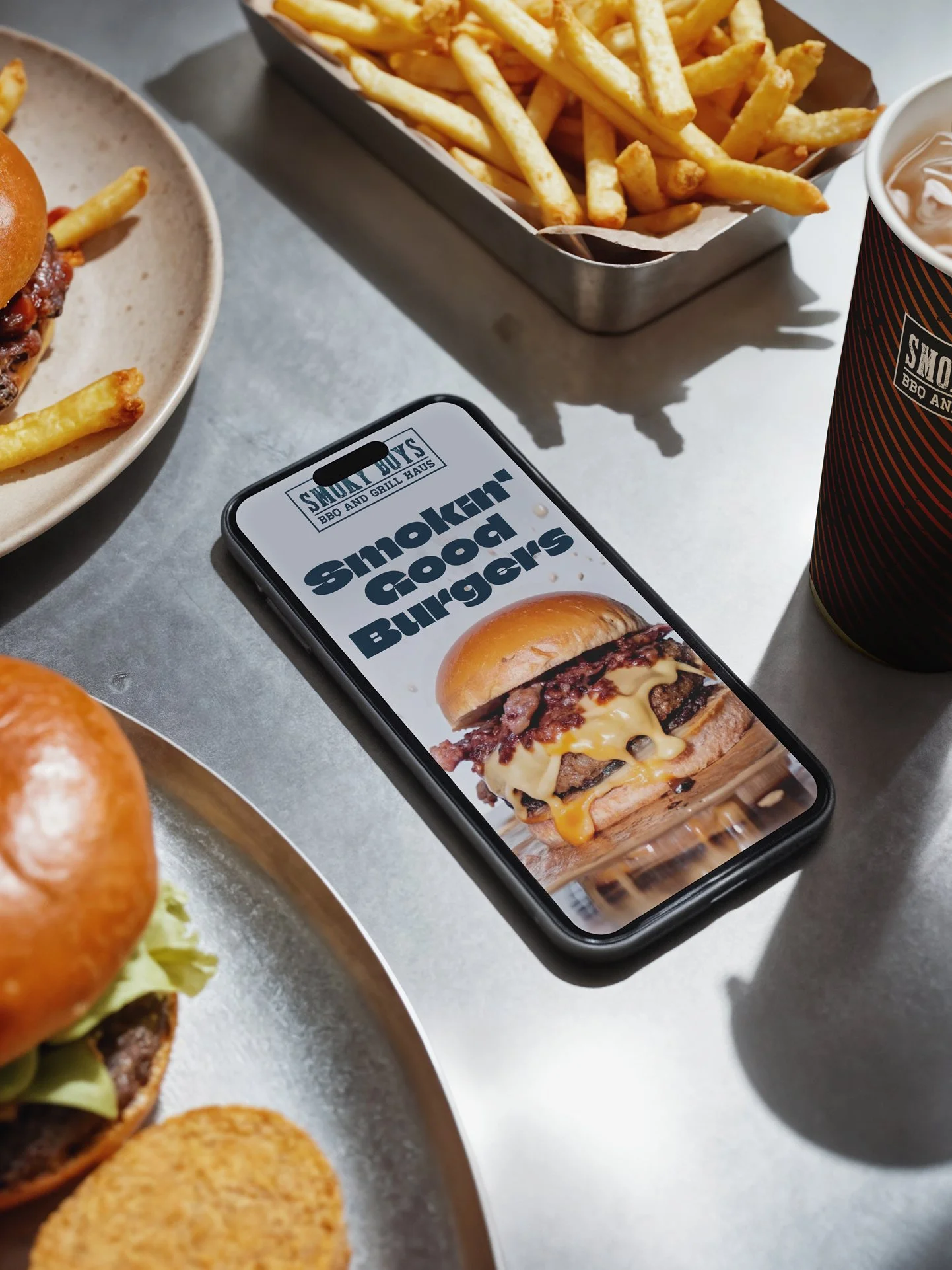
Rather than redesign, we commissioned a proper food photography and put the product front and centre - on the menu and the platform listings. The identity stayed exactly where it was. After seven years of trading on quality, the brand's job was to be recognised, not reinvented.
2023 - Repositioning
With twelve sites open and a long-term plan to move upmarket, Smoky Boys needed a brand that could carry premium menu items - and take existing customers with it.
We ran a transition rebrand: out went the rough fonts and kraft paper, in came a high-contrast palette of pink, gold and black. It landed with a younger audience who had previously read Smoky Boys as "somewhere you go with the family." without excluding the existing customers.
To hold the two sides f the business together (Quick Service and sit down eating), we introduced two typefaces: a bold, highly legible sans for the restaurants, and a faster, tighter face for the quick-service sites - same brand, different pace.
2026
Grown up,
not gone
The new chapter brought new food: From the Pit and the Sourdough Sandos.
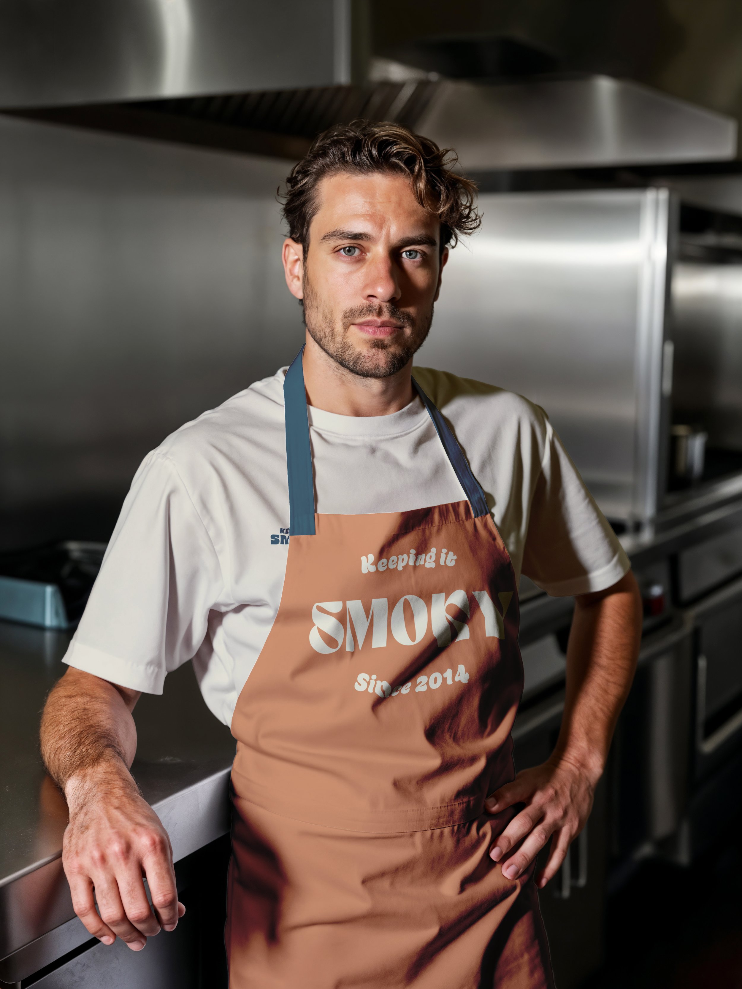
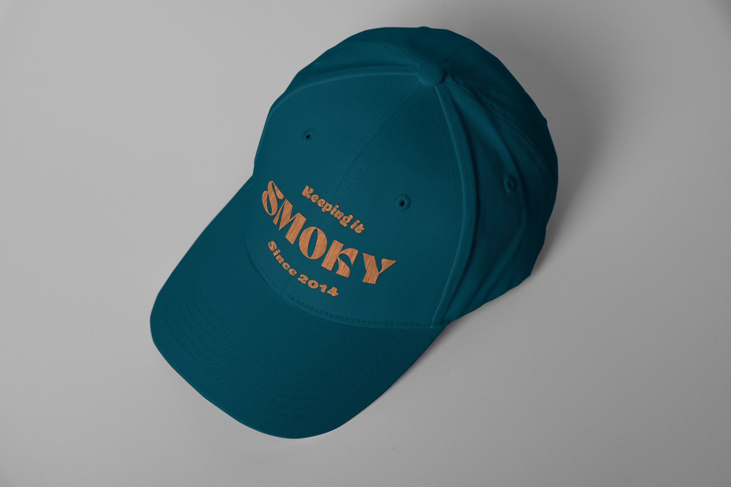
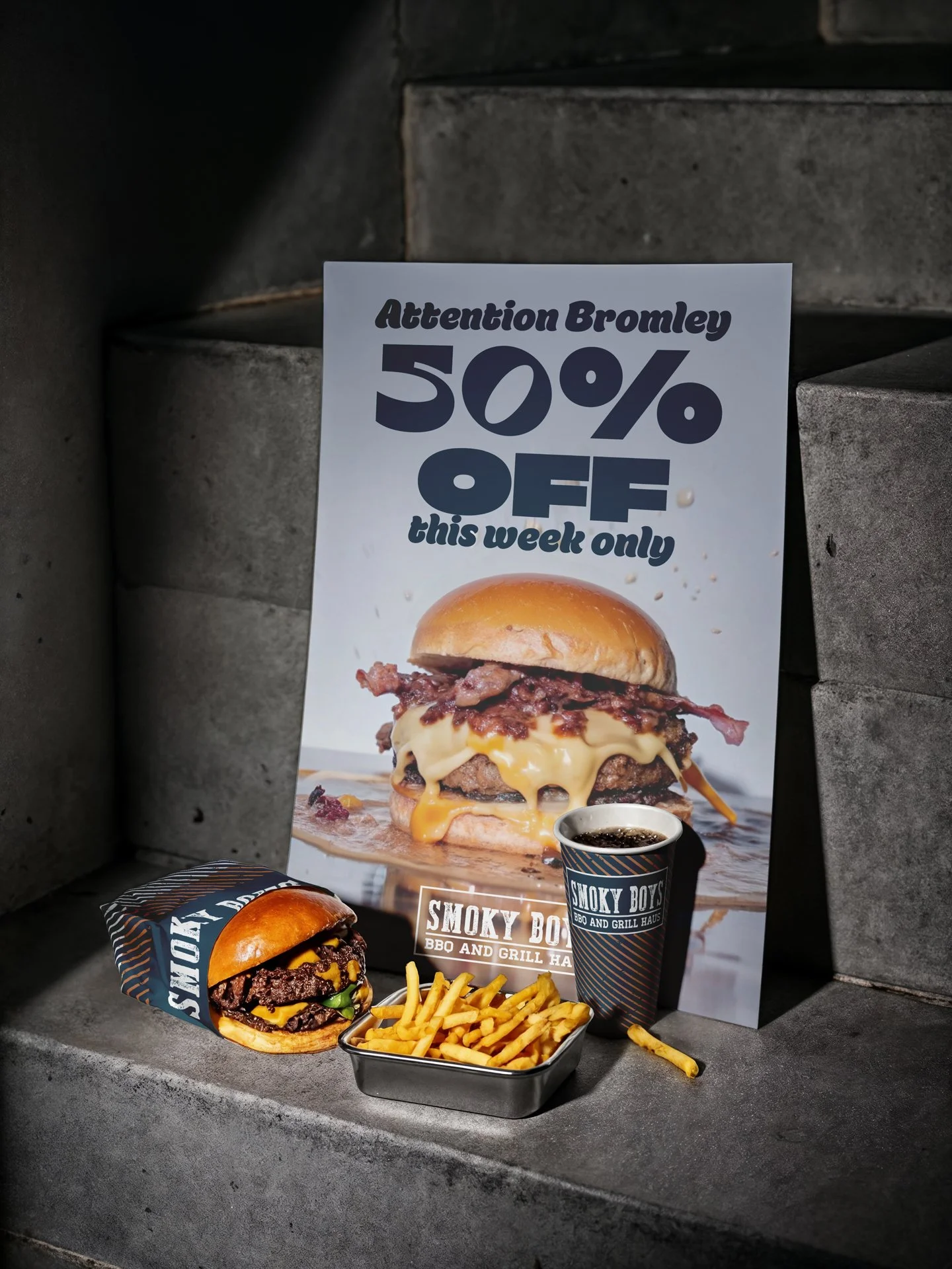
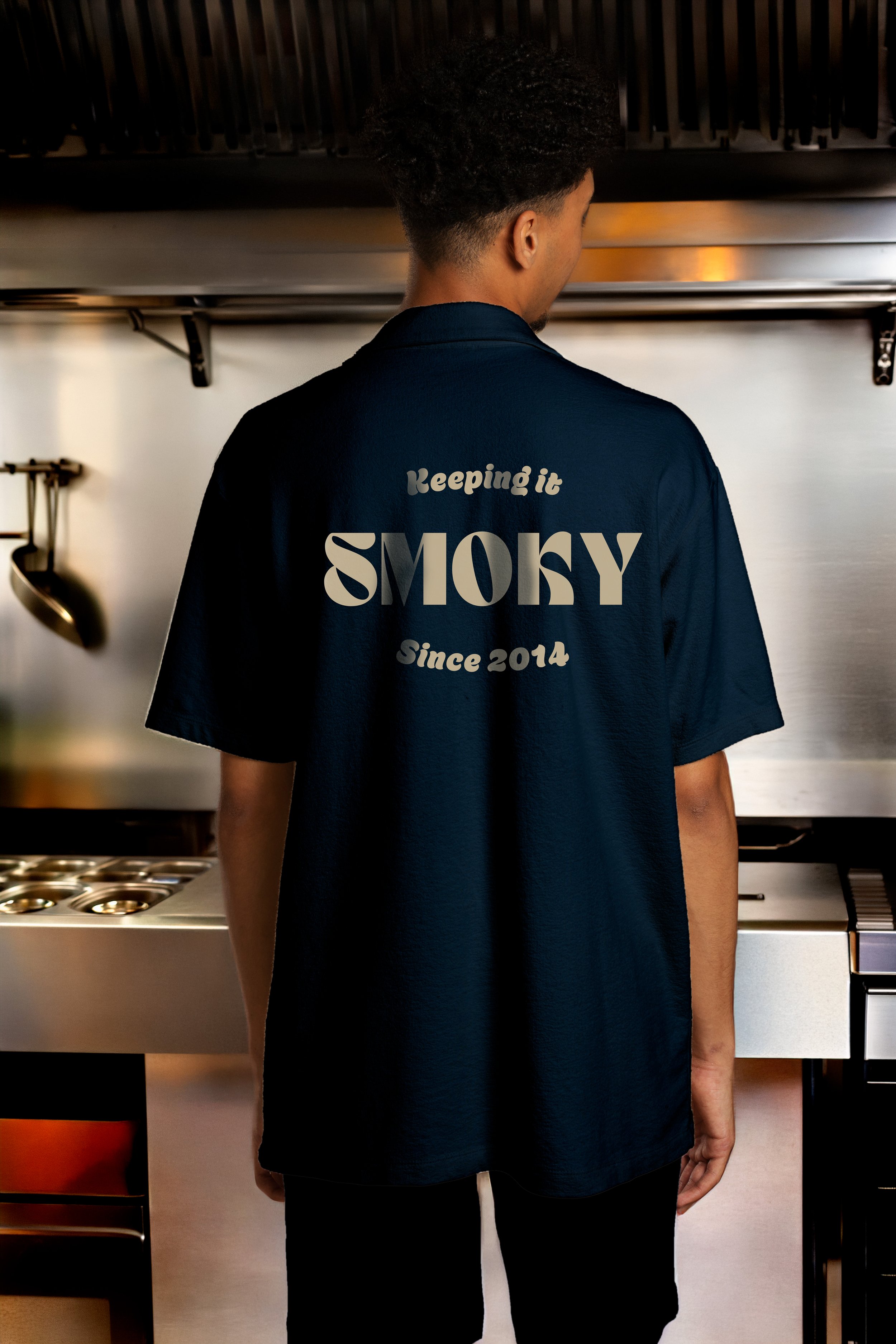
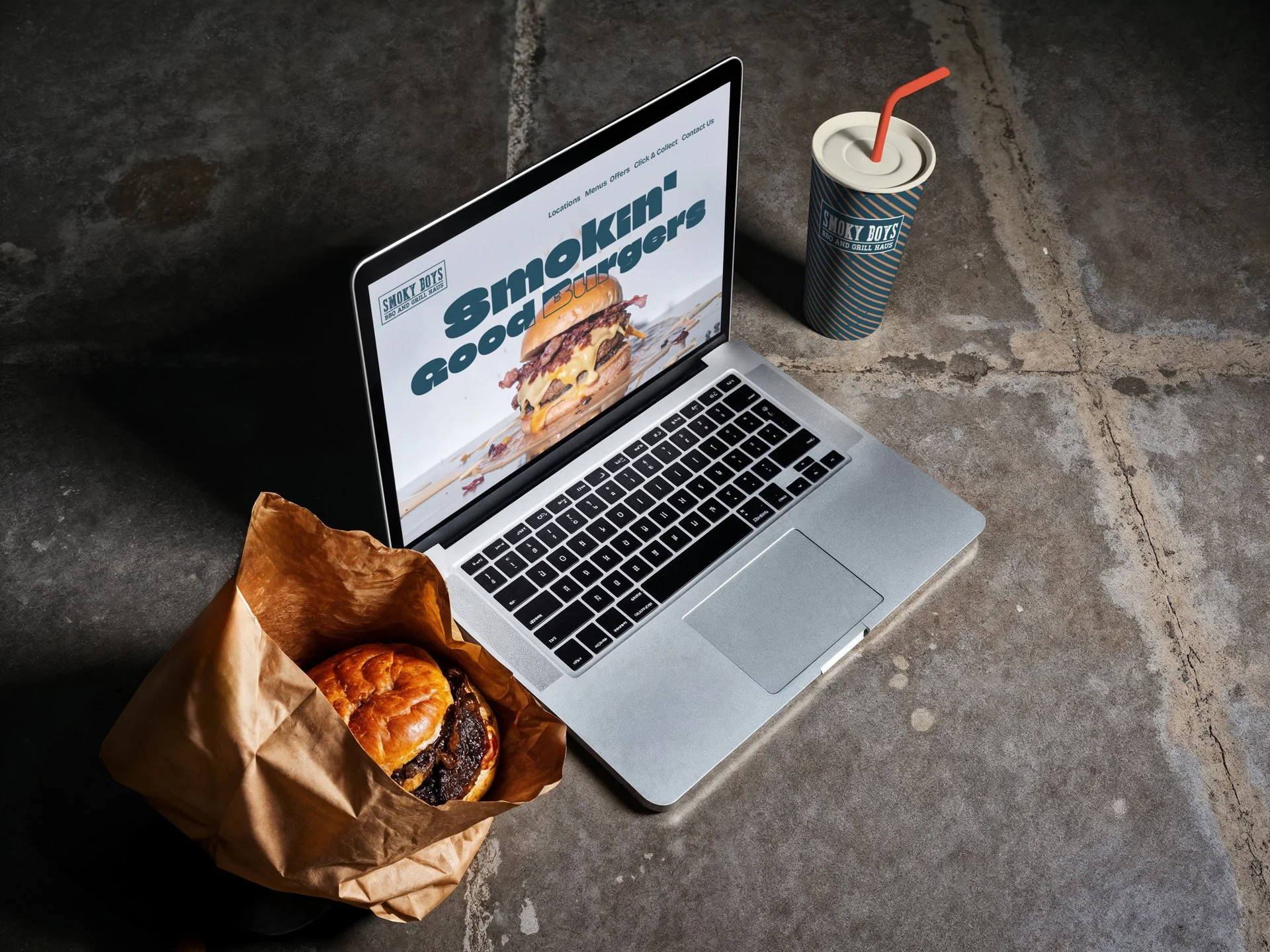
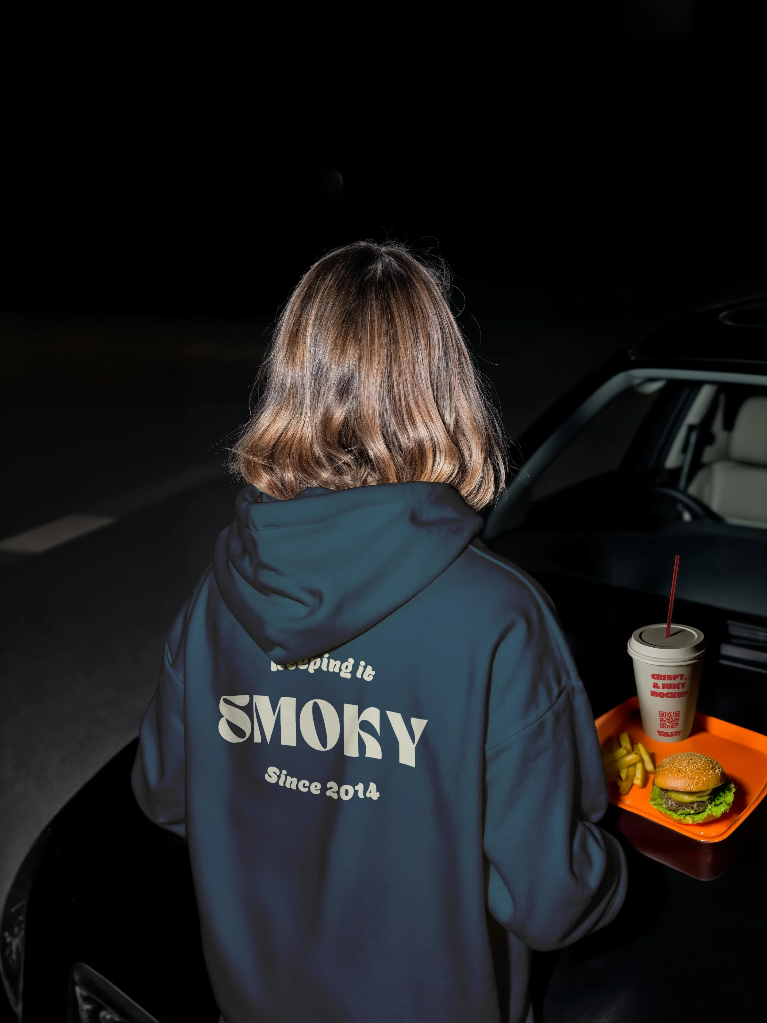
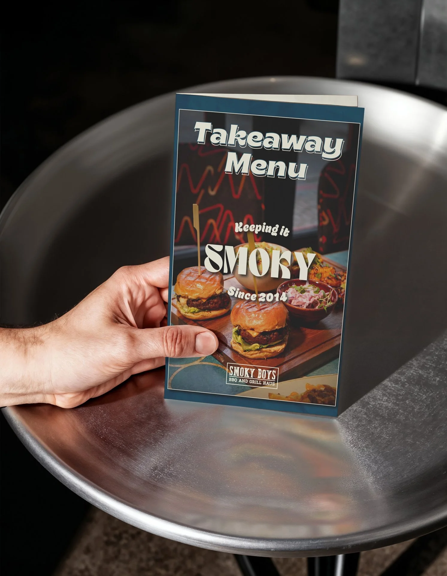
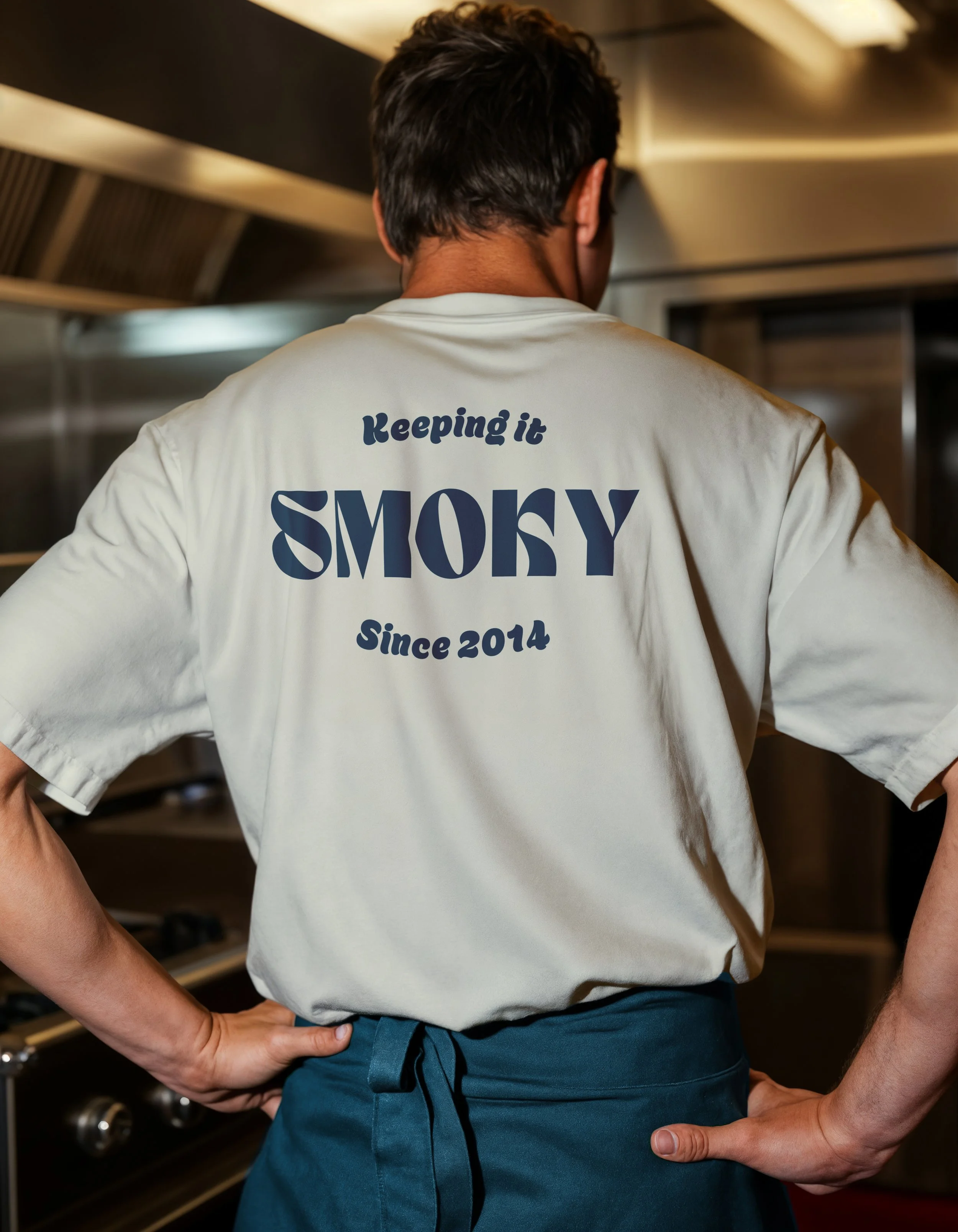
We cooled the previous palette into a mature blue paired with warm cream, cutting the colour system back to its essentials. Two new typefaces lift the brand while nodding to the original two-font structure.
Quieter. More confident. Still unmistakably Smoky Boys.
Results
10+ years
as Smoky Boys' designer
Long enough to know which parts of the brand were worth protecting and which were holding it back.
Scaled
from a single site to twelve UK sites
Across five evolutions, with new openings to be announced.
Identity
is now a franchisable asset
Targeting locations across the UK, Europe, Asia and the Middle East.